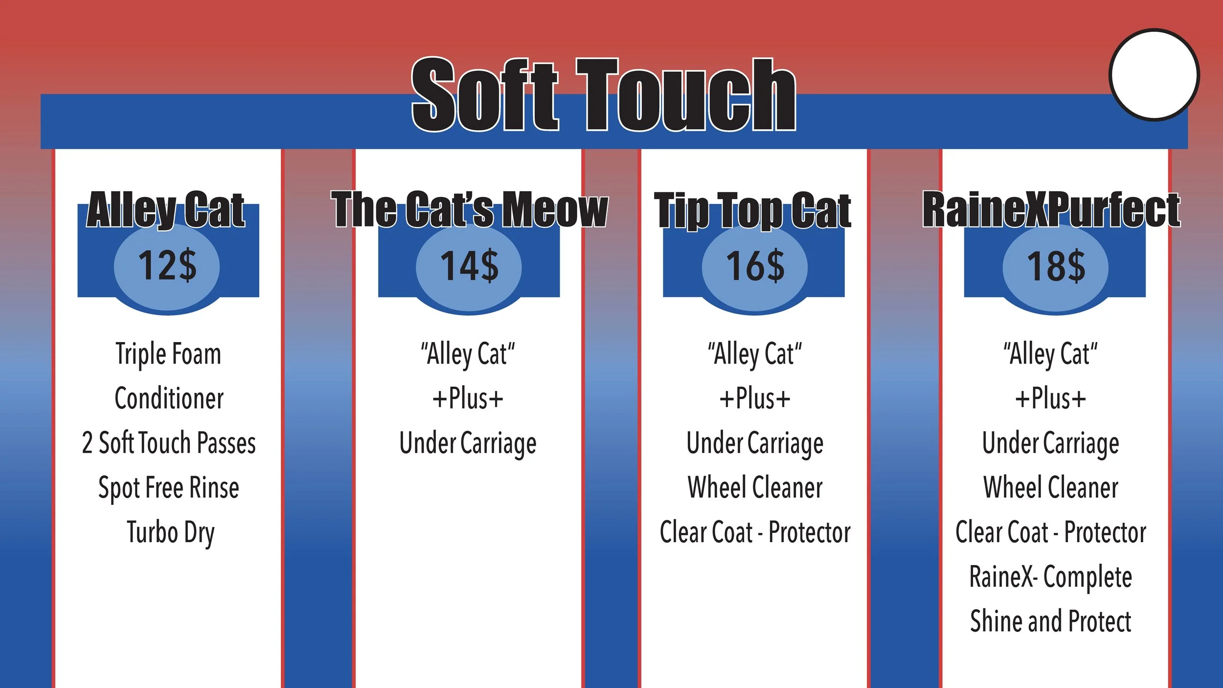
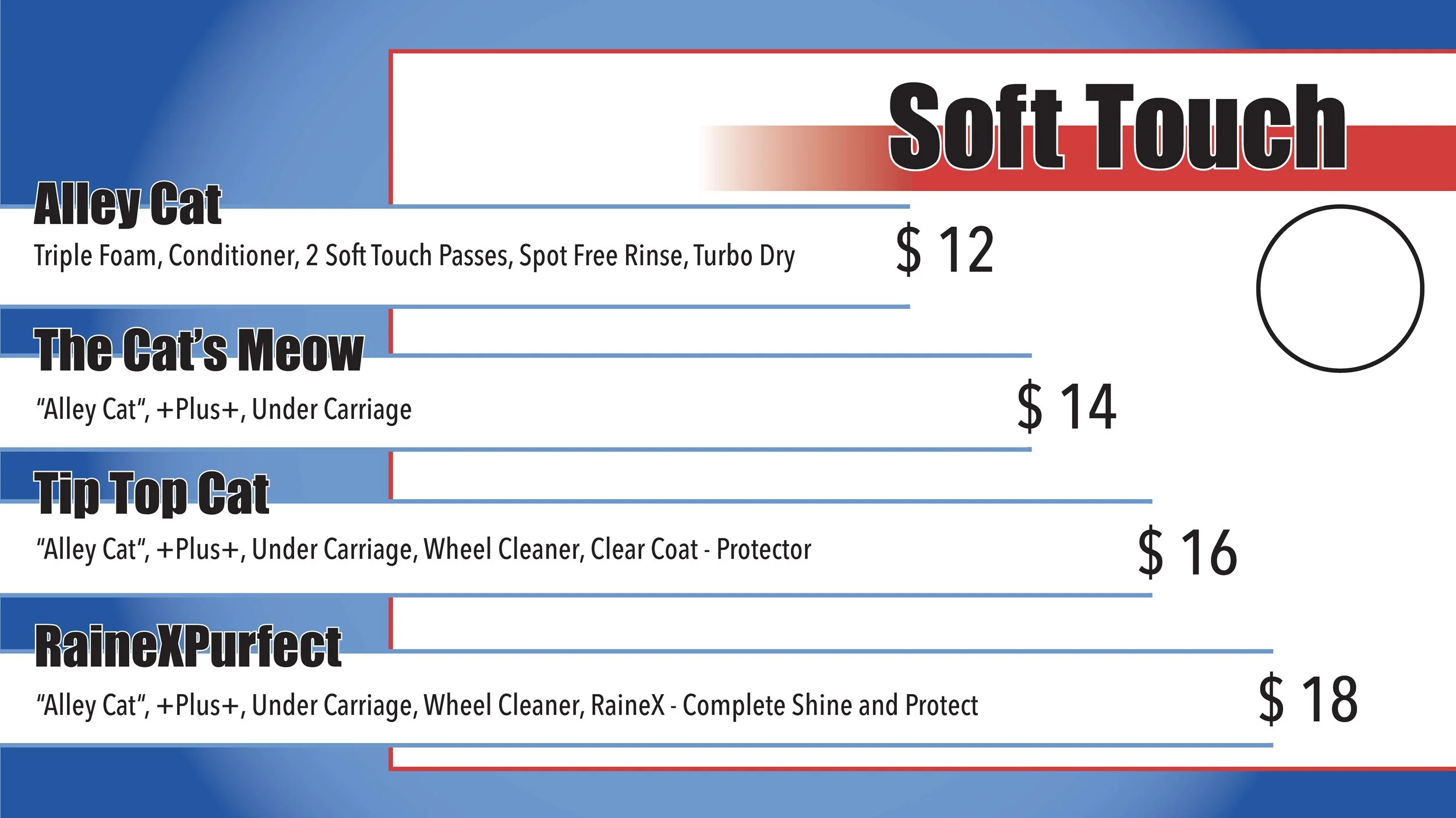
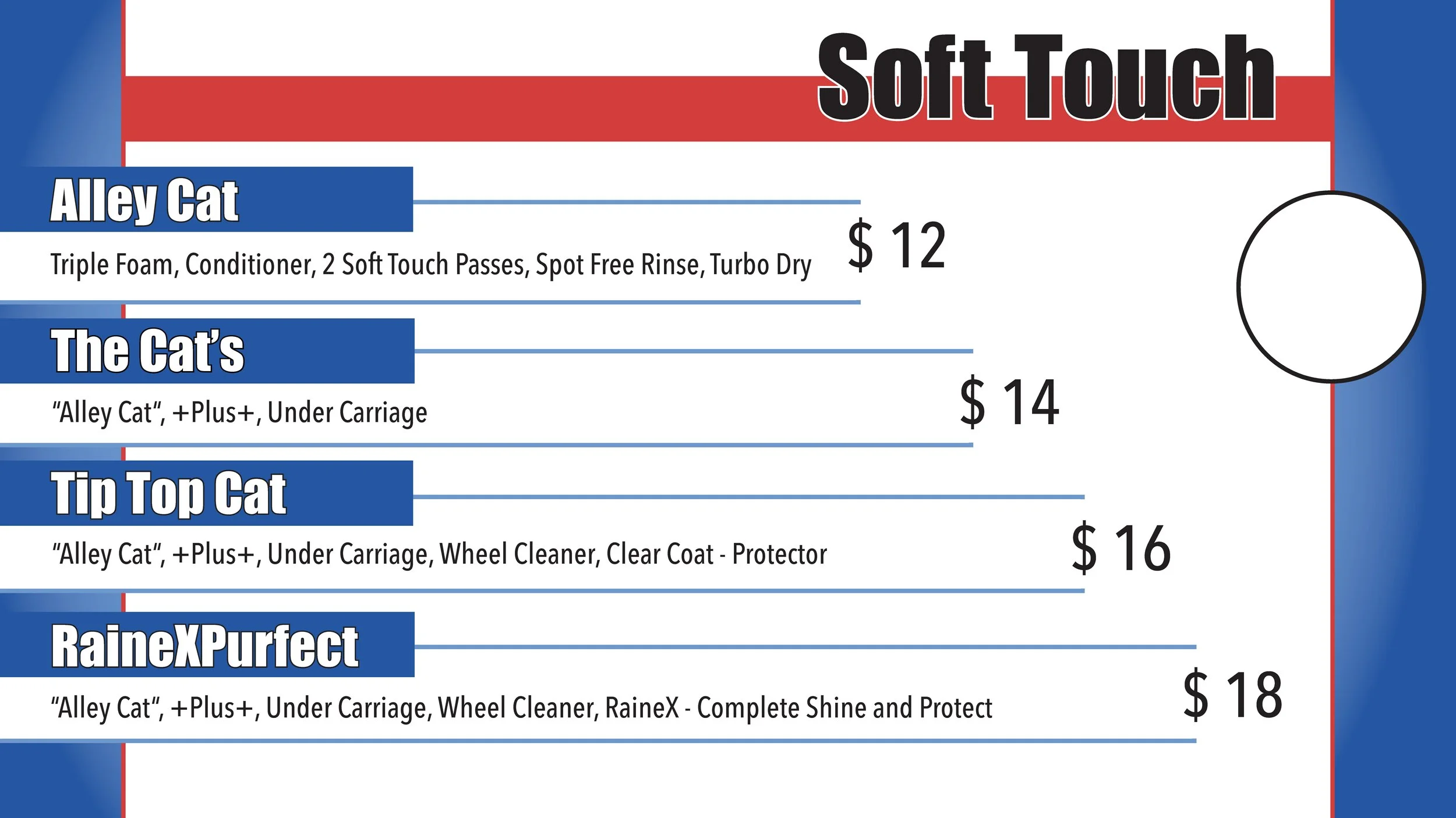
Top Cat Car Wash Menu
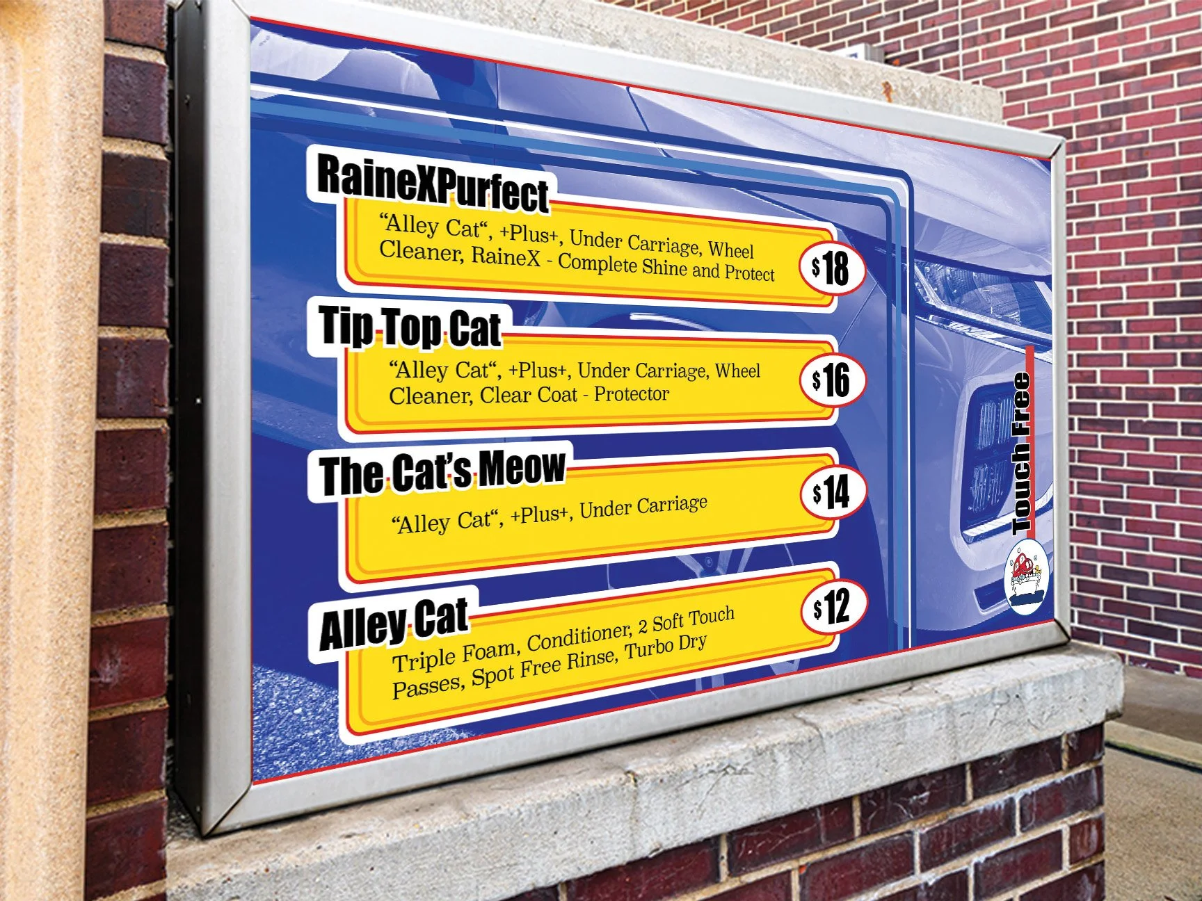
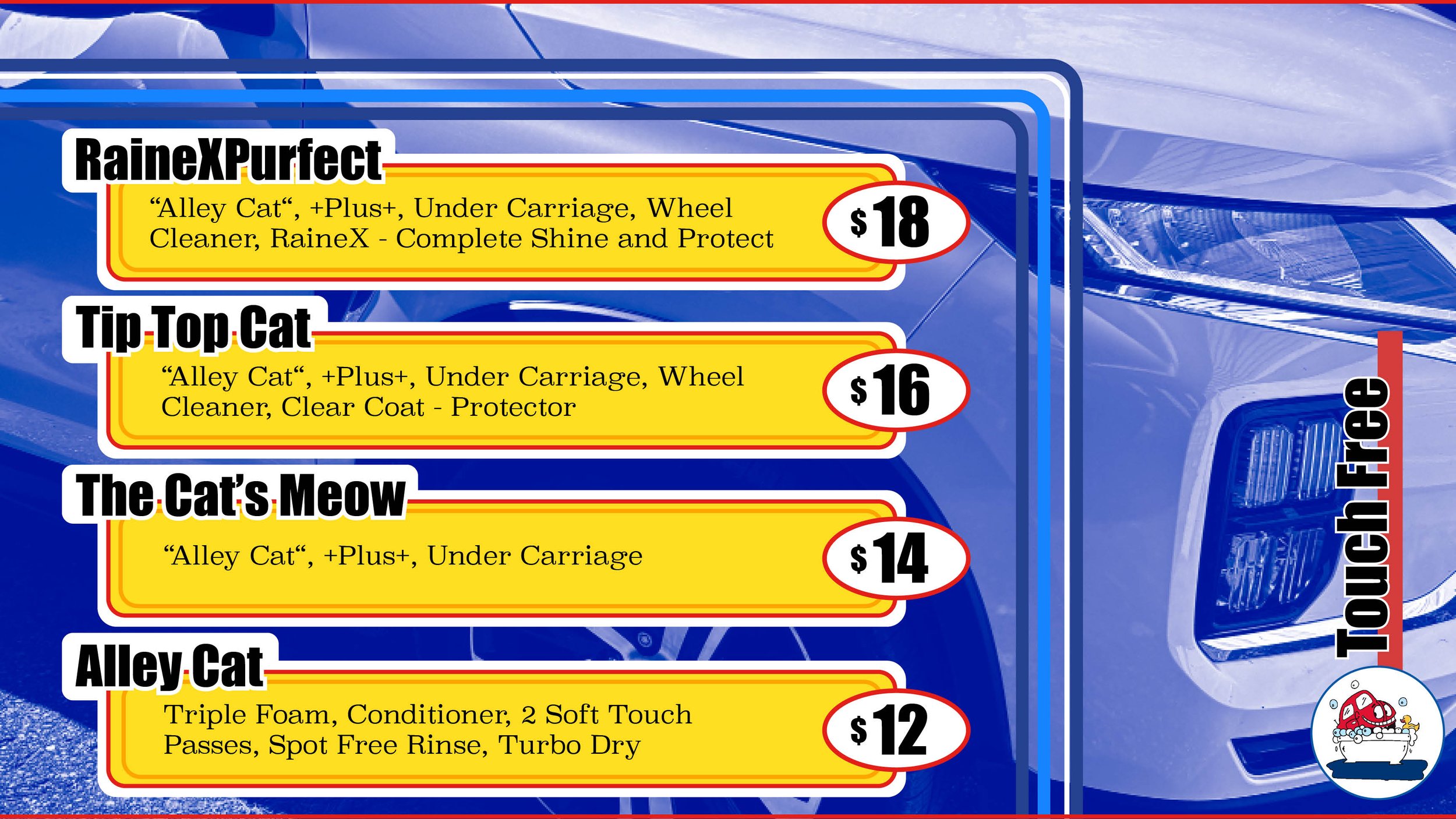
Concept: The goal for this project was to reimagine Top Cat’s car wash menu. The hope with the new menu was to create something more visually interesting.
Target Audience: This menu was created with the consumer in mind. The hope was to create something eye-catching that would draw them in, without overlooking readability.
Role in Project: To create this, I took inspiration from color block and pop art design. I looked at some of the work done by Andy Warhol to help myself understand how to best create a maximalist, bright design that didn’t look overdone. As well as took inspiration from color blocking wall art as a way to place the type on a busy image.
Skills: I used a combination of Adobe’s Photoshop and InDesign to create this design. I used photoshop to create the blue hue on the background imagery. Then took that into InDesign to create an effective layout.
Problems and Solutions: One of the challenges I faced with this project was creating a maximalist design that didn’t look out of place in a professional setting. Although car wash menus are notorious for being flashy and over the top, there is still a level of professionalism that they hold. I wanted to keep that in mind when designing Top Cat’s new menu. To do that, I researched car wash branding (logos, online presence, signage) and looked to see how these company’s designed their menu in relation with their branding.
The three designs pictured below were the first drafts based on the initial conversation had with the owner of Top Cat. From the conversation he wasn’t sure what he wanted change just knew that he wanted something more elevated then the old sign. Because of this, the hope with the three initial designs was to get a better understanding of what he was looking for stylistic preferences and layout direction.